
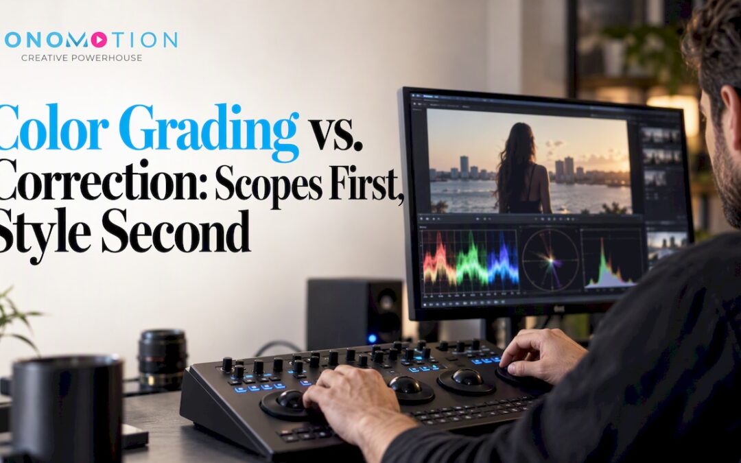
Color correction is the technical step that neutralizes exposure, white balance, and shot-to-shot inconsistencies, while color grading is the creative step that applies mood and style on top of that clean base. Correction always comes first because it builds the neutral foundation that makes every later creative choice predictable. Skip that order and even the best-looking grade will fall apart across scenes.
TL;DR:
- Use input or camera LUTs to bring Log footage into a working color space; apply creative look LUTs only after correction and shot matching.
- Check exposure, color casts, and saturation with waveform, RGB parade, and vectorscope readings, because an uncalibrated display can mislead visual judgment.
- Hire a dedicated colorist when shoots use multiple cameras, commercials depend on exact brand colors, or delivery includes HDR and several formats.
- Reserve an extra day or two for grading and quality control, then verify the output color space and clipping limits against delivery requirements.
Table of Contents
- 1. What Color Correction Actually Fixes
- 2. What Color Grading Adds Once Footage Is Clean
- 3. Why Correction Has to Happen Before Grading
- 4. The Tools That Make Color Work Repeatable
- 5. A Step-by-Step Checklist for Correction Then Grading
- 6. Common Mistakes That Undermine a Good Grade
- 7. How a Production Studio Handles Correction and Grading on Set
- 8. Deciding Between an In-House Edit and a Dedicated Colorist
- Let Our Team Handle Your Next Production’s Color Workflow
- FAQ
- Sources
1. What Color Correction Actually Fixes
Color correction is the objective, technical pass that gets footage looking accurate and consistent before anyone touches creative style. It is not about mood. It is about making sure a shot’s exposure, contrast, and color balance reflect reality, and that every angle in a scene matches the one next to it.
The core adjustments we handle during correction include:
- Exposure and contrast: balancing brightness so shadows and highlights hold detail instead of crushing or blowing out.
- White balance: neutralizing color casts caused by mixed lighting, like tungsten practicals against daylight windows.
- Black and white point adjustments: setting true black and true white levels so the image has proper range.
- Shot matching: aligning footage from multiple cameras, lenses, or takes so cuts feel seamless rather than jarring.
Correction leans on measurement, not instinct. Video scopes, specifically the waveform monitor, vectorscope, and RGB parade, give editors objective readings of luminance and color balance instead of relying on what a screen happens to show in a given room. The waveform tracks luminance levels across the frame, the vectorscope shows color balance and saturation, and the RGB parade breaks out each channel so editors can spot a cast immediately.
A notable discrepancy between the red, green, and blue channels in an RGB parade signals a color cast that correction needs to resolve before any creative work begins. That single readout often reveals a problem the naked eye misses entirely, especially on a monitor that is not calibrated.
Broadcast-safe and clipping checks round out correction work. Pushing contrast or saturation too far can push levels outside delivery specs, and scopes catch that before it becomes a problem in QC. Trusting a waveform over visual guesswork is the difference between a shot that holds up on every screen and one that only looks right on the editor’s laptop.
2. What Color Grading Adds Once Footage Is Clean
Color grading is where style enters the picture. Once footage is corrected and neutral, grading shapes how a scene feels: warm and inviting, cold and clinical, desaturated and somber, or bold and saturated for energy. It is a creative decision layered on top of a technical foundation, not a replacement for it.
Grading tools go beyond the primary adjustments used in correction. Colorists reach for:
- Secondary corrections: isolating a specific color or region, like deepening the green of foliage without touching skin tones.
- Masks and tracking: following a moving subject or object so an adjustment stays locked to it through the shot.
- Film emulation: applying characteristics associated with specific film stocks to add texture or nostalgia.
- Creative LUTs: one-click looks that shift the entire palette toward a target mood or brand identity.
Look LUTs belong at the end of the chain, applied after a scene is already corrected and neutral. A creative LUT built for warm, golden tones will behave inconsistently if the underlying footage still carries a green cast from fluorescent lighting. Grading assumes a clean starting point, which is exactly why correction has to happen first.
The distinction matters most in a corporate or commercial context, where a brand’s visual identity often depends on a consistent grade across every deliverable, from a hero spot to a social cutdown.
Pro Tip: Save your creative LUT as a separate adjustment layer or node so you can toggle it on and off during review, proving to a client that the grade is a deliberate creative choice, not a technical fix.
3. Why Correction Has to Happen Before Grading
The order exists for a practical reason: a creative grade behaves predictably only when it is built on a neutral, matched baseline. Apply a stylized look to footage that still has exposure or white-balance problems, and the grade amplifies those problems instead of hiding them. A warm teal-and-orange look pushed onto uncorrected, green-tinted footage will shift unpredictably from shot to shot, because each shot started from a different technical starting point.
Multi-camera and mixed-format projects make this even clearer:
- Ingest footage from multiple cameras and notice that each one renders color slightly differently, even under identical lighting.
- Apply correction to match every angle to a common reference before any stylistic work begins.
- Introduce the creative grade once all footage shares the same neutral baseline, so the look reads consistently across every cut.
Mixing Log footage from different camera makes this step non-negotiable. Log profiles are intentionally flat and desaturated to preserve dynamic range, and they vary by manufacturer. An input or camera LUT moves that Log footage into a working color space first, while a look LUT comes later to impose style. Color-managed systems like ACES exist specifically to make this handoff predictable across formats and software, keeping the technical and creative stages cleanly separated even on complex projects.
The one real exception is a deliberately raw or documentary aesthetic where minimal grading is the creative intent itself. Even then, basic correction, exposure and white balance, still happens first. Nobody skips that step entirely.
4. The Tools That Make Color Work Repeatable
Reliable color work depends on reading the image objectively rather than trusting a screen that might be miscalibrated or sitting in a bright room. Three scopes carry most of that weight.
The vectorscope plots color balance and saturation, showing whether skin tones sit where they should along the skin tone line and whether a cast is pulling the image toward one hue. The RGB parade separates the three color channels so editors can see exactly where red, green, or blue is out of balance, which is often the fastest way to diagnose a mixed-lighting problem.
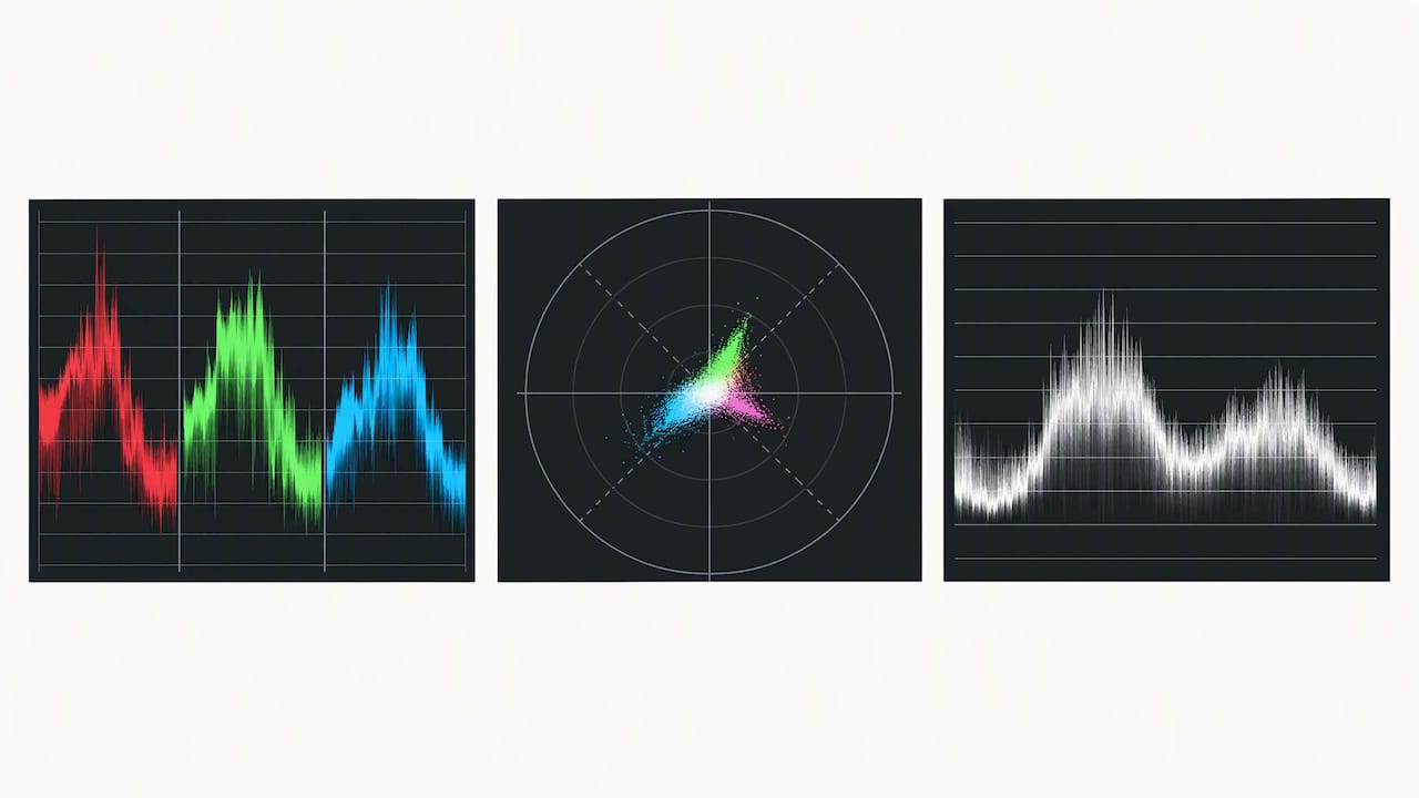
A noticeable gap between channels on an RGB parade is one of the clearest signs that correction work still needs to happen before any creative grading begins. Editors who rely on scopes instead of eyeballing a screen catch these problems before they compound across a timeline.
LUTs fall into two categories that serve different stages of the workflow:
- Input or camera LUTs translate flat Log footage into a usable working space early in the pipeline, making the image legible for editorial review.
- Look LUTs apply a creative style after correction is complete, layering mood on top of an already neutral image.
Color-managed workflows formalize this separation at the project level. ACES provides a standardized pipeline that keeps footage predictable across cameras and software. DaVinci Resolve’s YRGB Color Managed mode offers a similar framework inside a single application. Camera manufacturers publish their own guidance for working with their formats. ARRI, for example, provides specific project-setting recommendations for mixing LogC3 and LogC4 footage, including which input transforms to use and how timeline settings should be configured for HDR delivery. Following that kind of manufacturer guidance avoids the inconsistencies that show up when Log footage from different cameras gets treated as if it were identical.
None of this works without a calibrated display in a dim, controlled viewing environment. A bright room or an uncalibrated monitor can make a technically correct grade look wrong, and an uncorrected image look acceptable, which defeats the entire purpose of using scopes in the first place.
5. A Step-by-Step Checklist for Correction Then Grading
Running a short project through this sequence keeps the workflow consistent even under a tight deadline.
- Prep the project: ingest footage and assign the correct color space for each camera, applying input or camera LUTs to bring Log footage into a working space.
- Balance exposure: use the waveform to check luminance across the frame and adjust until highlights and shadows hold detail.
- Correct white balance: use the vectorscope and RGB parade to neutralize any color cast introduced by mixed lighting.
- Match shots: compare every angle in a scene side by side, adjusting until cuts feel seamless rather than noticeable.
- Build base contrast: establish the overall contrast curve that will serve as the foundation for the creative grade.
- Apply the creative look: introduce a look LUT or manual grade that establishes mood, tied to the project’s brand or story.
- Refine skin tones: use HSL secondaries and tracking to protect skin tones from unwanted shifts introduced by the grade.
- Check the delivery target: confirm the output color space, whether Rec.709, P3, or HDR, matches what the client or platform requires.
- Run final QC: check scopes one more time for clipping and broadcast-safe limits before rendering.
Pro Tip: Build a short checklist template in your NLE or grading software with each of these steps as a to-do, so nothing gets skipped when a deadline is tight.
This order protects against the most common failure: a beautiful creative grade that breaks the moment it hits a different screen or a client’s HDR television, because nobody verified the technical foundation first.
6. Common Mistakes That Undermine a Good Grade
A few recurring errors show up across editing bays, and most of them trace back to skipping or rushing correction.
- Grading on an uncalibrated display: a bright laptop screen or an ungraded monitor makes it impossible to judge color accurately, no matter how experienced the editor is.
- Applying a creative LUT too early: a look LUT dropped onto uncorrected footage amplifies existing problems instead of covering them.
- Ignoring skin tones during the creative pass: a bold stylistic grade can shift skin tones toward orange or green without careful monitoring.
- Trusting the eye over the scope: visual judgment shifts depending on room lighting, screen brightness, and even how tired the editor is that day.
Pro Tip: Check the vectorscope’s skin tone line every time you push a secondary adjustment or LUT, since skin tones are the fastest way a client will spot a grade that has gone wrong.
The fix for nearly all of these is procedural: calibrate the monitor, dim the room, and run scopes at every stage rather than only at the end. A color-managed pipeline removes a lot of the guesswork by enforcing consistent input and output transforms from the start.
7. How a Production Studio Handles Correction and Grading on Set
On a professional set, color management starts before a single frame reaches an editor. We work with a producer-led handoff that moves footage from the on-set data wrangler through editorial and into color, with each stage confirming the project is sitting in the right color space before moving forward. That structure keeps a commercial shoot or a multi-day conference from arriving in post with mismatched camera profiles or missing LUTs.
Deliverables vary by project type, which shapes how correction and grading get applied:
- Rec.709 deliverables for most web and broadcast placements, where consistent, accurate color matters more than a stylized look.
- Brand-matched looks for commercials, where a client’s established palette has to read the same across every spot we produce.
- Highlight grade passes for event coverage, where a fast turnaround still needs a consistent look across footage from multiple cameras and lighting setups.
Before any final render goes out, we run quality control against calibrated monitors, verify levels against scopes one more time, and confirm the output matches the agreed delivery specs. That final check is what catches a stray clipped highlight or an inconsistent shot before a client ever sees it.
8. Deciding Between an In-House Edit and a Dedicated Colorist
Not every project needs a dedicated colorist, but certain signals make that investment worth it. Multi-camera shoots, brand-critical commercials, and anything delivering in HDR or across multiple formats benefit from a colorist who can manage color-managed pipelines and catch inconsistencies an editor working alone might miss under deadline pressure.
What a studio environment adds beyond a single editor’s setup is calibrated grading suites, producer oversight that keeps the project on schedule, and final QC before anything ships. Those layers catch problems before a client sees them rather than after.
For a production schedule, it is worth budgeting an extra day or two specifically for grading and QC rather than treating it as an afterthought squeezed in before delivery. That buffer is usually what separates a rushed-looking final cut from one that holds up across every screen it reaches.
— Bernard Bonomo
Let Our Team Handle Your Next Production’s Color Workflow
Correction and grading are managed as part of every project produced, from brand-critical commercials to fast-turnaround event highlights, ensuring footage holds up across screens and deliverables. Producers can coordinate the handoff from set to editorial to final color, keeping each project in a color-managed pipeline from ingest to render.
That coverage spans several of our core services:
- Corporate video production with brand-matched color across every deliverable.
- Event videography and photography with fast-turnaround highlight grading.
- Live streaming services with on-set monitoring and LUT setup for real-time broadcast.
- Explainer video production with creative grading tied to brand identity.
FAQ
Is color grading the same as color correction?
No. Color correction is the technical process of neutralizing exposure, white balance, and matching shots so footage looks accurate and consistent. Color grading is the creative step applied afterward to establish mood and style, and the two are typically treated as separate stages even though they often use the same software tools.
Should I color grade or edit first?
Editing, meaning picture lock, generally happens before any serious grading, since color decisions depend on which shots and cuts are actually staying in the final piece. Within the color process itself, technical correction always comes before the creative grade.
What is the 60/30/10 rule in color grading?
This guideline comes from interior design and general color theory, not a standardized rule within professional color grading workflows, so its application to video grading varies by practitioner. Some colorists borrow the general principle, using one dominant tone, one secondary tone, and one accent tone, but it is not a formal grading standard.
Is color correction worth it?
Yes. Correction is what makes footage usable and consistent across shots, cameras, and lighting setups, and skipping it causes problems that show up later as clipped highlights, mismatched skin tones, or an unpredictable grade. It is a foundational step rather than an optional polish.